Posts

Business Cards

Image
    For my first logo, I used primary colors, so I wanted the business card to be simpler. I used gray and white for the background and blue for my name to make my logo really pop out.     My second logo had three different colors, so I made the background black and white checker print. I thought it would be interesting to put the information in different boxes to incorporate the colors in the logo.     My last logo was pink and purple, so I wanted to make a girly business card. I chose a pink background (inspired by Elle Woods's resume) to compliment the purple type for my information.

Indesign Tutorials

 https://www.youtube.com/watch?v=0eqhUFRlvgI https://www.youtube.com/watch?v=AshfNo-i8Ws https://www.youtube.com/watch?v=g-lm_rP79C4

Autoscopy

Image
      I have recently discovered a lot about myself. For my autoscopy, I wanted to represent being human. I compared my body to space (using sun and moon shapes), yet made the human brain and heart the biggest aspects of my piece.       Humans are so small compared to space, or even the ocean. I put a lot of pressure on myself to be the best I can be, but my mental health can sometimes stand in the way. That's why I'm trying to take everything less seriously, because we're all humans and we all make mistakes.

Black and White to Color

Image
    For this picture, I used split complimentary colors. I was inspired by the primary colors to make my dog and and I stand out from the background and each other.     I used double split complementary colors for this piece. I was inspired by sunset vibes with this palette. For this picture, I used a triad of colors. I wanted my dog and I to stand out from the background and have a ghostly feeling to us.  

Photoshop Tutorials

 https://www.youtube.com/watch?v=BQQqnn2uZv4 https://www.youtube.com/watch?v=xQyceKmZTR8 https://www.youtube.com/watch?v=KAmSB5MQxOo

Tag Brush

Image
      For my tag brush, I wanted it to look messy, but also have a darker tint to it. I wanted the outside of the logo to be lighter on the left and darker on the right since the logo has such a sharp contrast between the black circle and white cloud. For the color piece, I wanted the colors to be gloomy to match the cloud, but also a bit feminine to be representative of me.

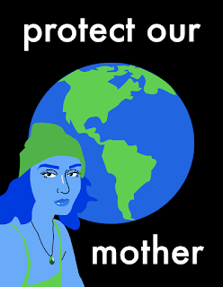
Self Portrait Poster

Image
    I wanted to make my propaganda poster about environmentalism. Saving the planet is a big topic right now with global warming, pollution, industrialism, etc. and many global authorities aren't concerned about the state of the planet. Earth is our only home and we need to protect it.     I decided to use my selfie to personify Mother Earth. I changed the colors to blues and greens to match earth and added a black background with white lettering to capture the viewer's attention. I wanted my poster to look minimalistic with little dimension and color variation to keep it simple and to the point.